Stock Embeddings - Learning Distributed Representations for Financial Assets
Note: This blog post summarises a paper I wrote at the beginning of my PhD (quite a while ago now) Stock Embeddings: Learning Distributed Representations for Financial Assets. Data and code are available at https://github.com/rian-dolphin/stock-embeddings.
How do stocks relate to each other? Certain pairs of stocks are well-known as similar - consumer brands like Apple and Microsoft, for example. But what about less obvious connections? And how can we quantify these relationships beyond simple categories or basic correlation?
In finance, understanding these connections is crucial for building good portfolios – you want stocks that work well together, but also some that zig when others zag to reduce risk. While machine learning for predicting returns has gotten lots of attention, quantifying these deeper relationships hasn't seen as much interest.
Inspired by how computers learn the semantic meaning of words (like in Word2Vec), in this post we ask: Can we teach a computer about stock relationships just by looking at how their prices move?
Our recent paper, "Stock Embeddings: Learning Distributed Representations for Financial Assets", explores exactly this. We developed a way to create Stock Embeddings: dense vector representations for each stock, learned purely from relational information mined from historical price data.
The Big Idea: Stock Embeddings are Learned by the Company They Keep (pun intended)
In NLP, models like Word2Vec learn that words appearing in similar sentences (contexts) tend to have similar meanings. The classic example uses vector math: if $\mathbf{v}(\text{word})$ represents the vector embedding for a word, then
$$ \mathbf{v}(\text{King}) - \mathbf{v}(\text{Man}) + \mathbf{v}(\text{Woman}) \approx \mathbf{v}(\text{Queen}) $$
The concept of gender is captured in the embedding space and emerges in the vector algebra!
We applied a similar logic to stocks: Stocks whose prices often move similarly, might be related.
Here's the rough idea:
-
Gather Daily Returns: We looked at the daily returns for hundreds of US stocks over many years (2000-2018). For a stock $a_i$ with price $p_t$ at time $t$, the return $r_t$ is simply: $$ r_{t}^{a_{i}} = \frac{p_{t}^{a_{i}} - p_{t-1}^{a_{i}}}{p_{t-1}^{a_{i}}} $$
-
Find "Context Stocks": For any given stock $a_i$ on any given day $t$ (our "target"), we found a small handful of other stocks (the "context" $C_t$) whose returns $r_{t}^{a_{j}}$ were the closest (smallest absolute difference $|r_{t}^{a_{i}} - r_{t}^{a_{j}}|$) on that specific day. Think: If Apple went up 1.5%, which other stocks also moved very close to +1.5% that same day? Maybe Microsoft and IBM were context stocks for Apple on that day.
-
Train an Embedding Model: We built a simple neural network that learned a vector embedding, let's let $\mathbf{e}_i$ denote the embedding for asset $a_i$. During training, the core idea is to predict the target stock's embedding using the embeddings of its context stocks.
-
Learning Happens: By doing this over and over for all stocks across all days, and applying back propagation, the network adjusts the embeddings $\mathbf{e}_i$. Stocks that frequently end up as context stocks for each other, or share similar context stocks, get their embeddings pushed closer together in the latent vector space.
-
Noise Reduction: Stock data is notoriously noisy, so we added a couple of tricks:
- Giving more weight to context stocks that consistently appear together with the target over time.
- Ignoring days where the target stock barely moved (filtering out returns within the inter-quartile range of market returns on that day). In experiments, this trick made a big difference!
After this process, we had learned a set of embeddings (vectors) where the distance and direction between them capture nuanced relationships learned directly from market dynamics.
What Can We Do With These Embeddings?
1. Finding Similar Stocks (Beyond Obvious Labels)
Just like $\mathbf{v}(\text{cat})$ is close to $\mathbf{v}(\text{dog})$, our stock embeddings $\mathbf{e}_{i}$ put companies with similar market behavior close together. We measured similarity using the standard cosine similarity between embedding vectors.
Take a look at JP Morgan Chase (a major bank). Its closest neighbors based on our embeddings? Bank of America, State Street, and Wells Fargo – all also major banks!
| Query Stock (Sector - Industry) | 3 Nearest Neighbours (Sector - Industry) | Similarity (Cosine) |
|---|---|---|
| JP Morgan Chase Finance - Major Bank |
Bank of America Corp - Finance - Major Bank State Street Corp - Finance - Major Bank Wells Fargo & Company - Finance - Major Bank |
0.88 0.82 0.81 |
| Analog Devices Technology - Semiconductors |
Maxim Integrated - Technology - Semiconductors Texas Instruments - Technology - Semiconductors Xilinx, Inc. - Technology - Semiconductors |
0.93 0.91 0.90 |
(Remember, the model only saw price returns during training, not sector labels!)
We can visualize this. Here's a graph where stocks are nodes, coloured by their GICS sector. An edge means their embeddings are very similar in the learned embedding space (cosine similarity > 0.7). Notice how they cluster?
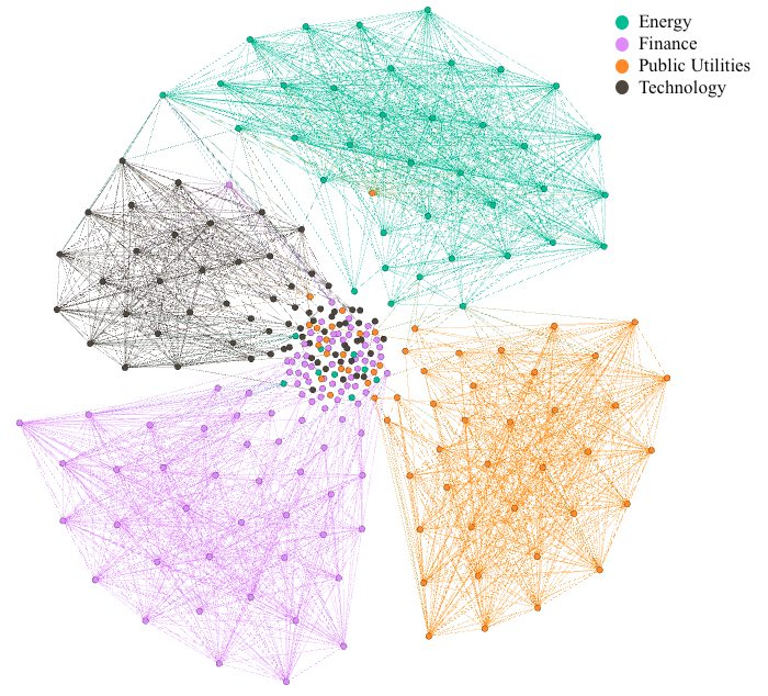 Figure 3: Stocks tend to cluster with others in the same sector based on embedding similarity.
Interestingly, sometimes the embeddings revealed inconsistencies in official (GICS) labels. For example, Lennar Corp (classified as "Basic Industries" by GICS) was found to be extremely similar to KB Home (GICS "Capital Goods"). Our embeddings correctly learned that they are similar (their business models both focus on home building) based on market returns patterns, despite the different high-level sector label in the ground truth data.
2. Smarter Hedging?
Disclaimer: This is a VERY naive experimental setup - purposely so. We wanted to focus on the simplest case to pit the embedding space versus something tried and tested like correlation. The purpose is to demonstrate the embeddings capture something interesting and could potentially be leveraged in portfolio optimisation if explored further.
Hedging is about reducing risk, a really basic way of doing this is by pairing an asset with another that moves oppositely (typically using negative correlation).
We wanted to see if we chose a hedge as the stock whose embedding is most dissimilar (lowest cosine similarity), rather than using raw correlation, would that result in lower volatility portfolios?
We simulated simple two-stock portfolios: one query stock, one hedge stock. The hedge was chosen either by lowest embedding similarity or by traditional correlation measures (like Pearson). We then looked at the portfolio's volatility (risk) over a test period (2013-2018) that the model hadn't seen when learning the embeddings.
The Result: Portfolios hedged using embedding dissimilarity consistently showed statistically significantly lower volatility than those hedged using standard Pearson correlation!
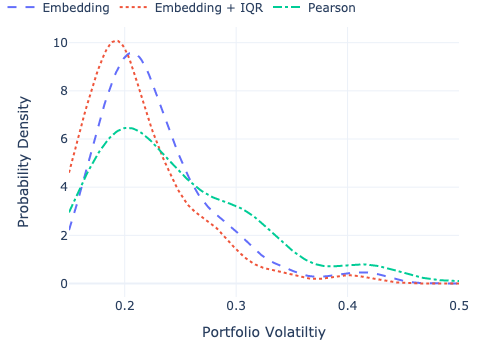 Figure 4: Embedding-based hedges (blue, green) shifted the volatility distribution lower compared to the Pearson correlation baseline (orange).
| Method | Avg Volatility | Significantly Lower than Pearson? |
|---|---|---|
| Pearson (Baseline) | 23.8% | - |
| Embedding + IQR Filter | 21.3% | ✓ (Yes!) |
| Embedding (Full) | 21.9% | ✓ (Yes!) |
(Results shown for the best embedding variant and one other vs. Pearson. See paper/Table V for full details)
This suggests that embeddings capture aspects of risk and relationship that go beyond simple linear correlation, potentially leading to better diversification strategies.
What's Next?
This is just a starting point! We've shown that learning stock embeddings directly from returns is feasible and can uncover useful relationships for tasks like classification and hedging.
We have some more recent papers on this topic that can be found (along with the code to implement this) at the GitHub repo.
Want the nitty-gritty details?
- Read the full paper on arXiv: https://arxiv.org/abs/2202.08968
- Check out the code and data on GitHub: https://github.com/rian-dolphin/stock-embeddings